Don’t Deny the Changing Tides of Business
Some business owners, especially those with a bricks and mortar business, might like to pretend the Internet isn’t happening. This can be particularly true for private physical therapy practices that have been around for a while and have never needed to make any real drastic changes to adapt with the times. They think if they ignore what’s happening around them and put their heads in the proverbial sand, it will all go away.
Sorry, but for those of you stuck in denial and the past, it’s time to take your heads out of the sand and face reality. The Internet isn’t going anywhere. It’s here to stay. It’s like a juggernaut that’s thundering along, gaining more and more momentum, and all your potential patients are moving with it.
Get Mobile-friendly Now
Right now, just having a website is not enough. It is vital that your practice has strong web presence with a mobile-friendly version.
[note_box]
Your patients are not going to wait until you have one created. If they can’t see your site properly (if at all) on their smart phones, they will likely take their business somewhere else…your competition.[/note_box]
This is not scaremongering. The statistics all around are warning us what is happening right now: 49% of mobile subscribers in the United States own a smart phone, and they are eager to find information about your practice and possibly come to you with their business.
These numbers are growing: 9 out 10 phones now sold today are smart phones. In the first quarter of 2012 alone, almost 145 million smart phones were sold. By the end of 2012, it was estimated that more smart phones would be sold than PCs, with estimated sales of 657 million smart phones sold to consumers. As an experiment, ask your friends and family what kind of phone they have. If they don’t have a smart phone at the moment, no doubt they will tell you that they will be getting one soon.
A Vital Component of Everyday Life for Some
Smart phones are an important part of your patients’ lives. Some people may even get addicted to them, constantly using them for Twitter posts, updating their Facebook status and shopping online.
If you provide treatment services that they want, they will expect to be able to see your website on their phone. If your website content is not easy to read on a mobile phone, you are in trouble, because most mobile users will simply leave your site and take their business elsewhere.
So even if you don’t think you need a mobile version of your website, you will actually be doing your practice a lot of harm by ignoring the statistics and your customer’s needs. Every day you don’t have a mobile website you may be losing potential patients interested in your practice who decide to go elsewhere.
Future-proofing Your Practice
Having a mobile website will future-proof your practice by opening the doors to literally hundreds of new and creative ways to drive traffic to your site. For example QR (quick response) codes will allow you to create unlimited marketing campaigns that will drive potential patients to specific mobile friendly landing pages with calls to action that work.
Recent figures show that 50% of Smartphone uses have scanned a QR code and 18% of them made a purchase afterwards as a result. That’s an easy increase in business you wouldn’t have gotten without your mobile marketing platform. The opportunity to improve your practice’s web presence and boost business with something as simple as a QR code should be clear.
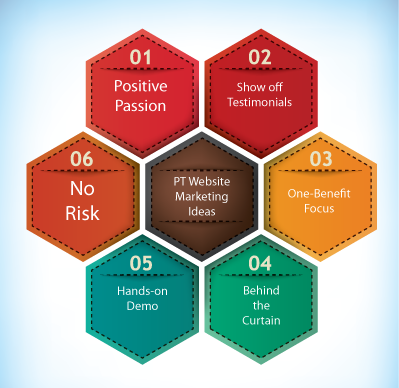
Another important point to focus on is you need get your name out there to constantly remind your potential patient-base of who you are and how you’re interested in helping them improve their condition. Using the right tools and resources is vital. Some business owners attempt to draw attention to their business by throwing away good money on large newspaper ads, the Yellow Pages and flyers.
Newspapers and the Yellow Pages are part of a dying business model, and in most cases, it’s a waste of time putting a one-time advertisement in them. Flyers are expensive and only reach a limited demographic.
Mobile marketing is the most effective way of keeping in contact with your current and potential patients that may have forgotten you or not known that you were there.
Consult Us for Additional Expert Guidance
We would advise any private practice considering using mobile marketing to reach potentially millions more customers to contact us at E-Rehab to discuss how you can employ traffic generating marketing strategies and turbo-charge your practice.
Having a mobile-friendly site will not only impress your patients, but will set you well apart from your competition, who still have their heads in the sand and are refusing to acknowledge that times are moving at such a terrific pace.
[colored_box bgColor=”#788794 ” textColor=”#ffffff “]Keep up with the times and bring your practice up-to-date with a web-based marketing strategy and you’ll notice a change in the way you’re perceived.[/colored_box]

 The Internet has had a profound effect on the way that people communicate and interact with each other. The changes have also had a dramatic influence on the business world by altering the way that consumers make purchases and seek out services.
 Great news: somebody has visited your website. Hurrah! Perhaps they might look around and decide to schedule an appointment for treatment…but wait…oh no! Now they are leaving. “What? They only stayed for five seconds.” Yes, it’s very possible that they stayed long enough to be appalled by your website and then made a quick exit to one of your competitors. If your site is not converting visitors into patients, then you might be committing one of these deadly website mistakes: